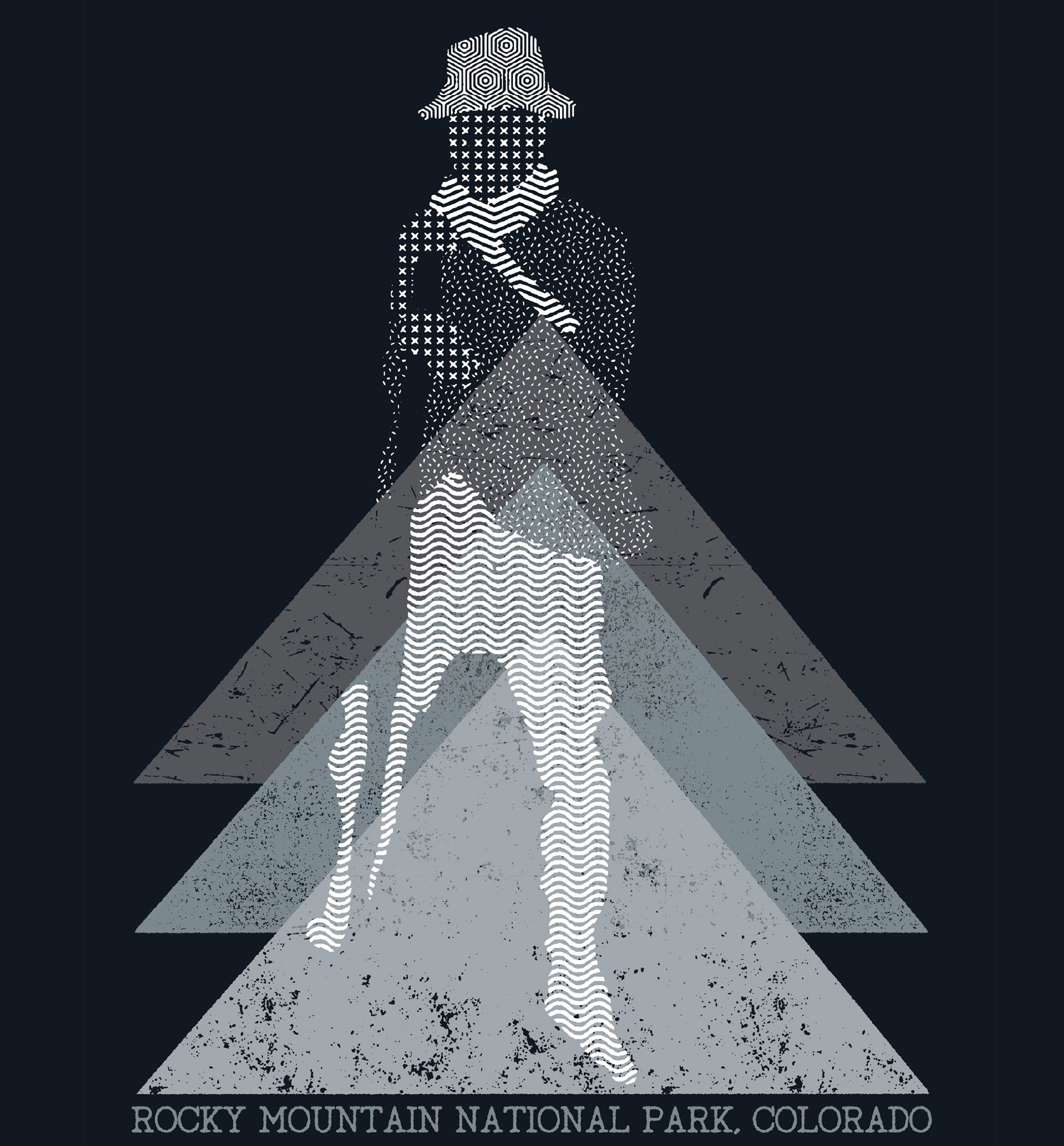
Apparel Design

PRINTED MATERIAL
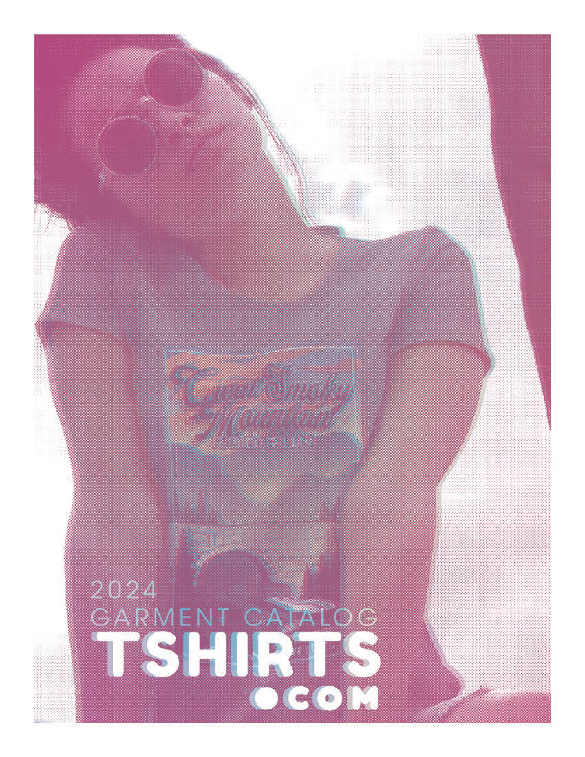
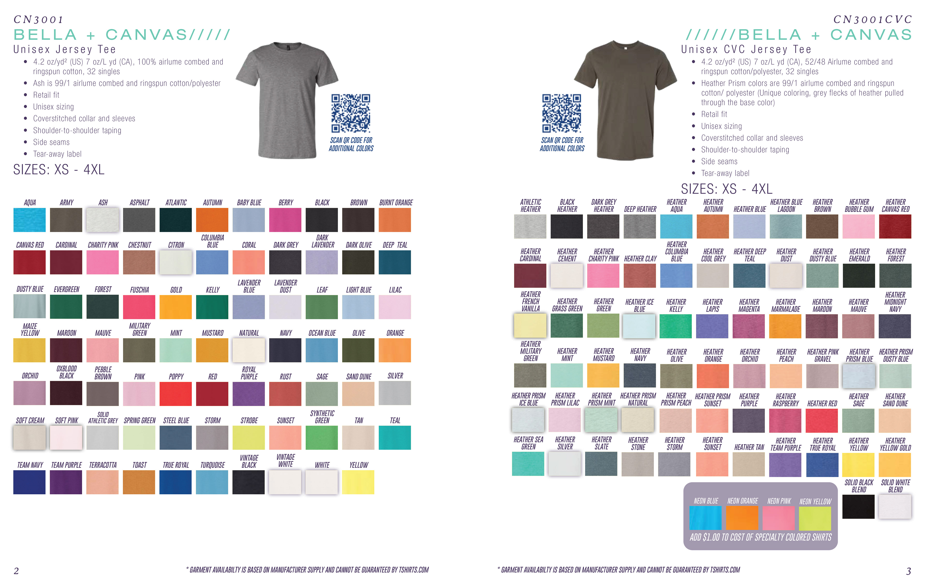
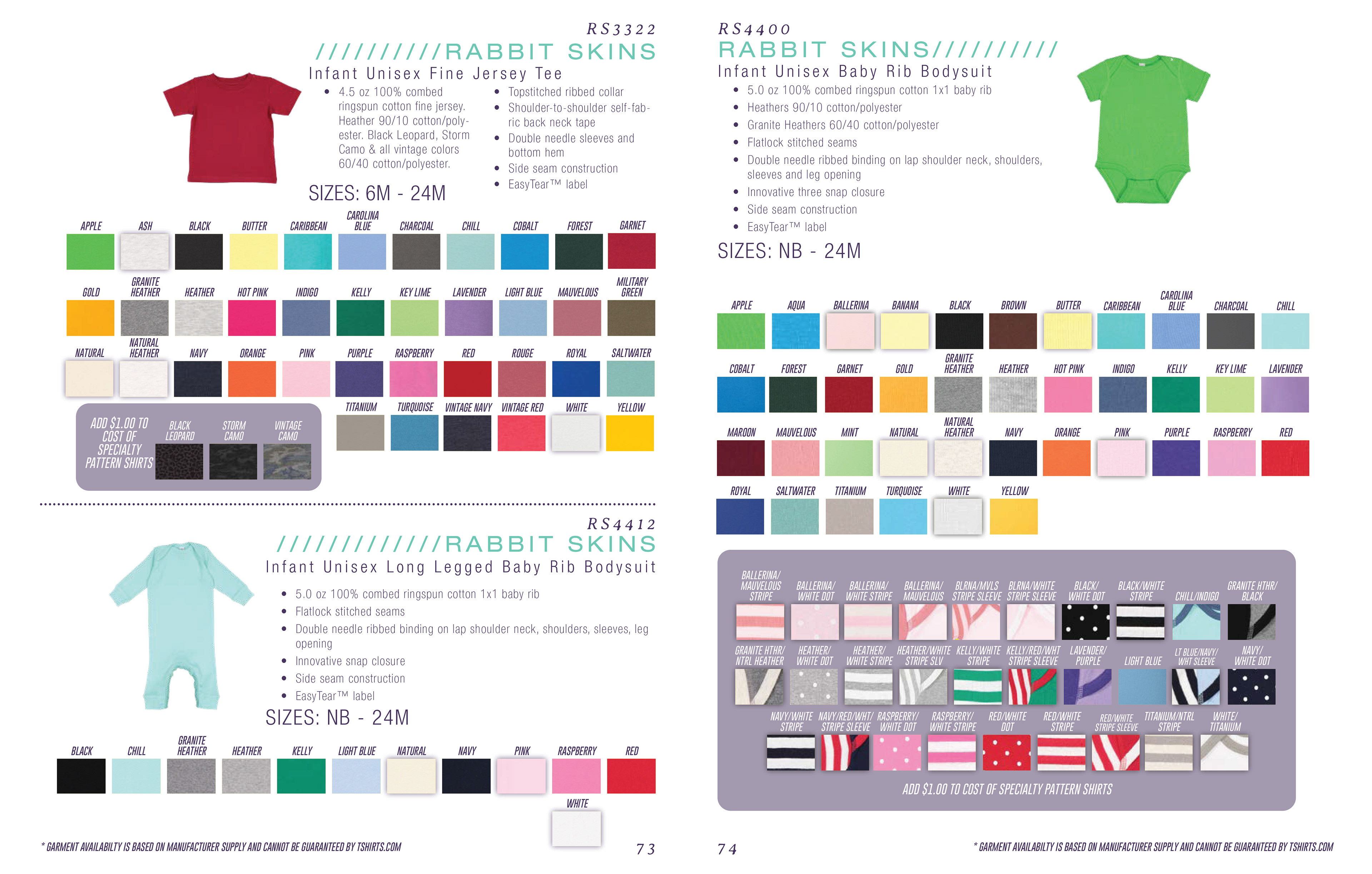
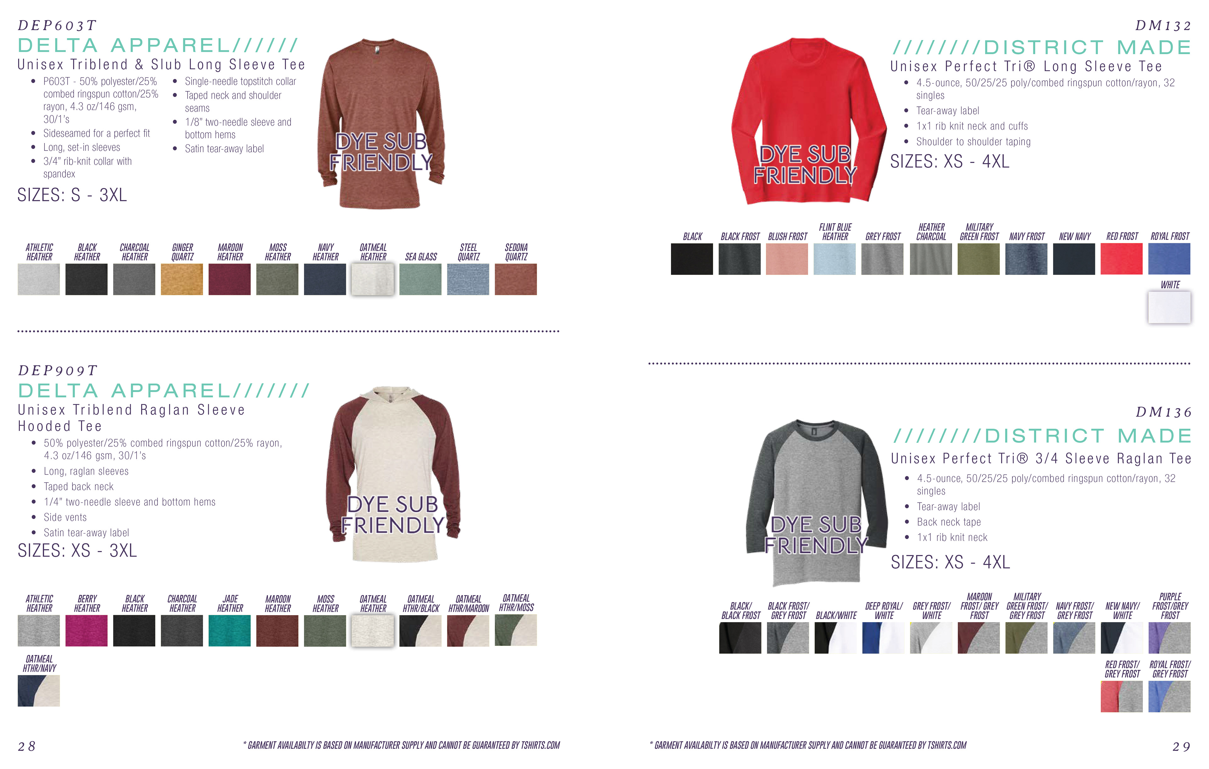
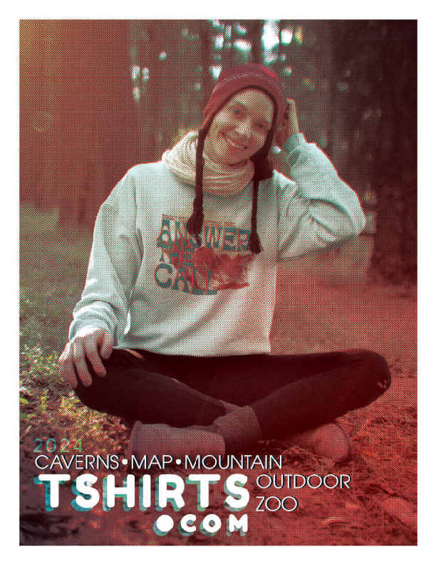
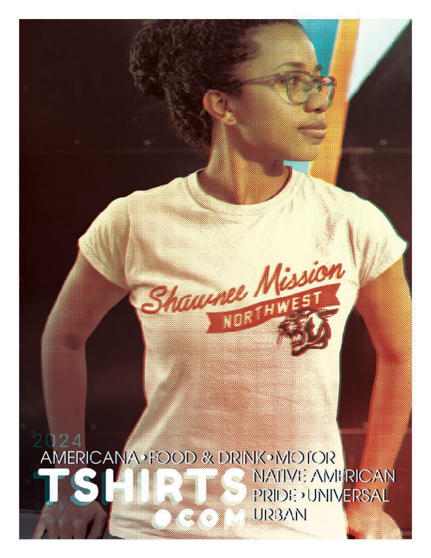
PRODUCT CATALOGS TSHIRTS.COM


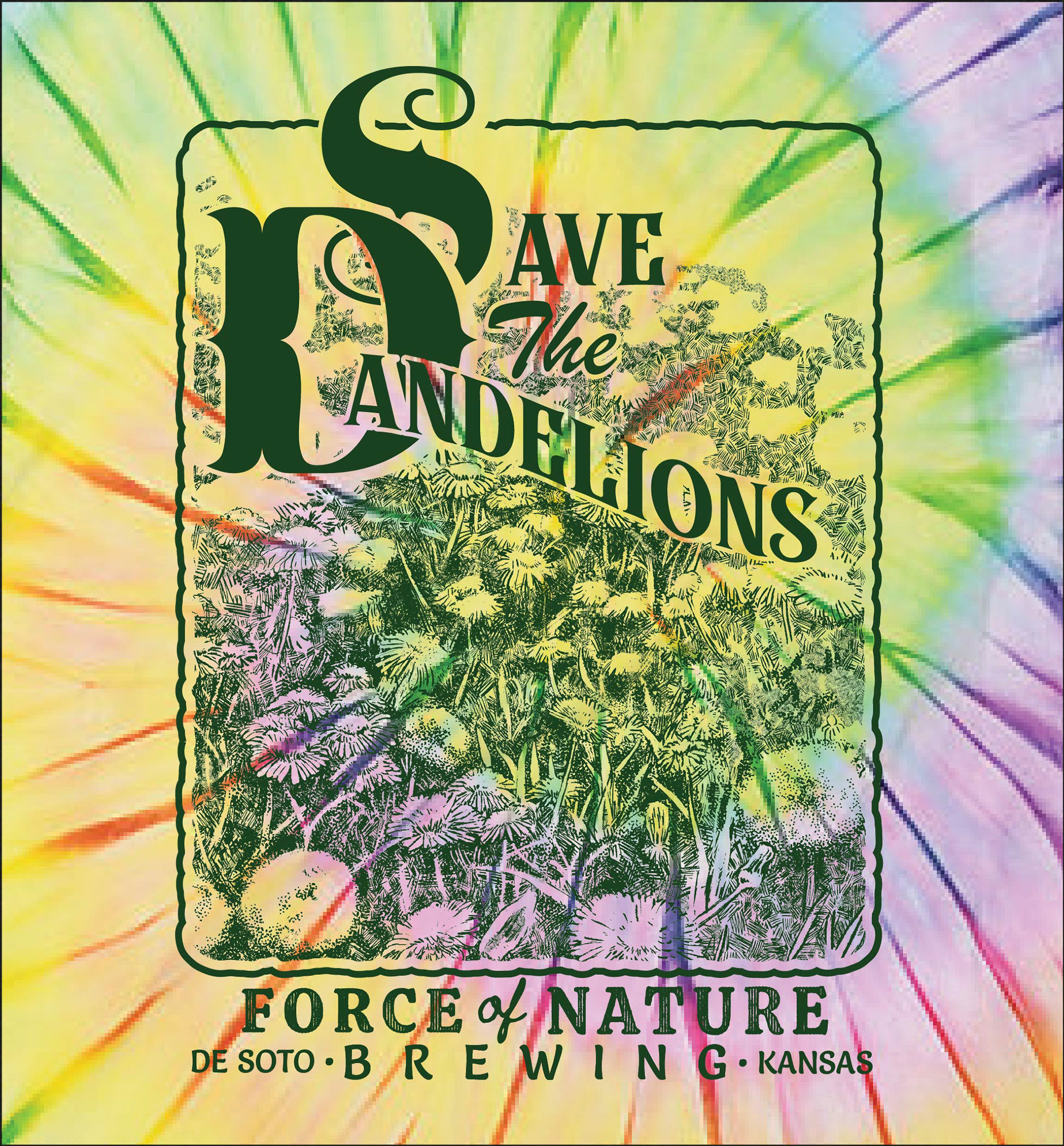
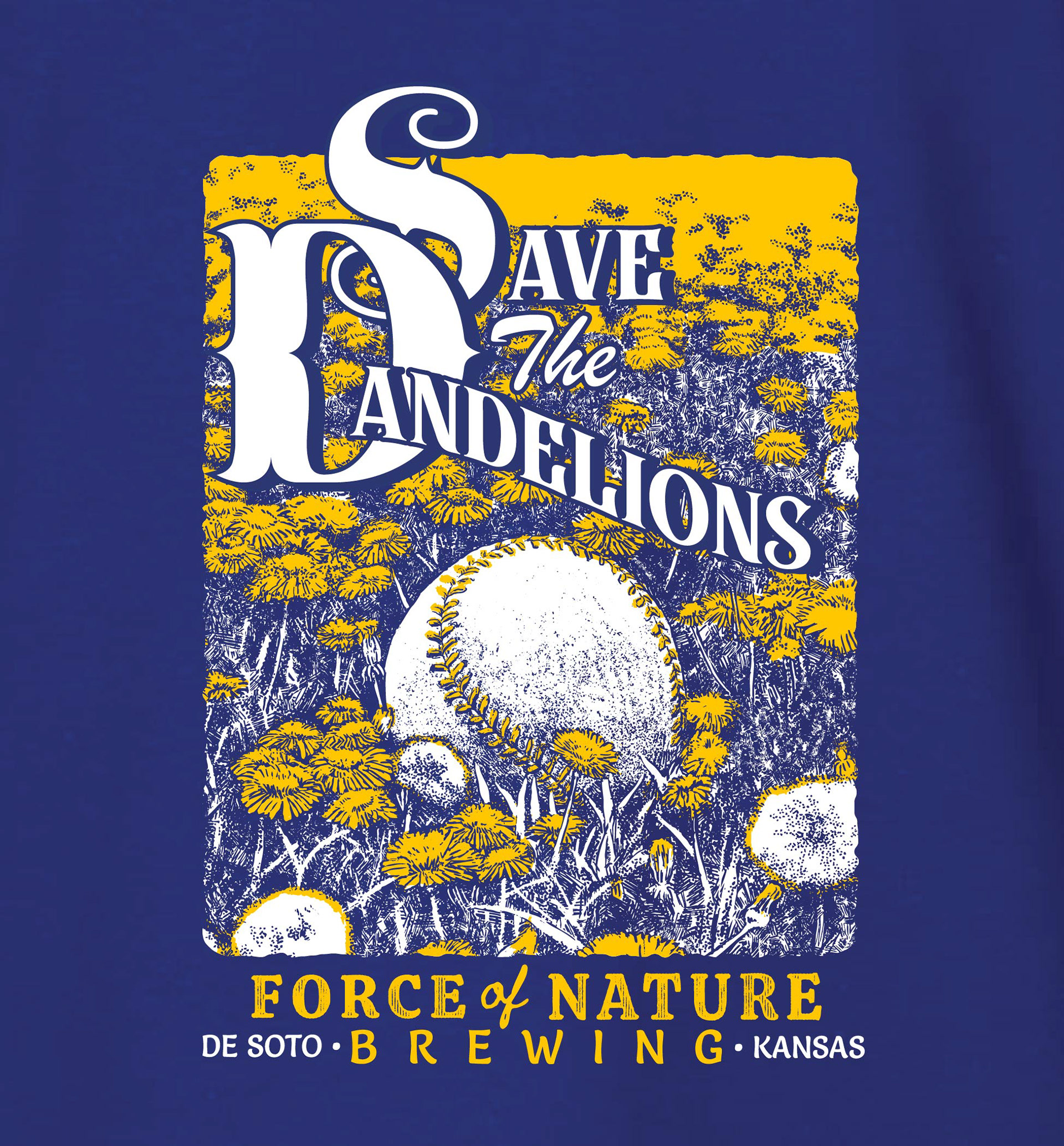
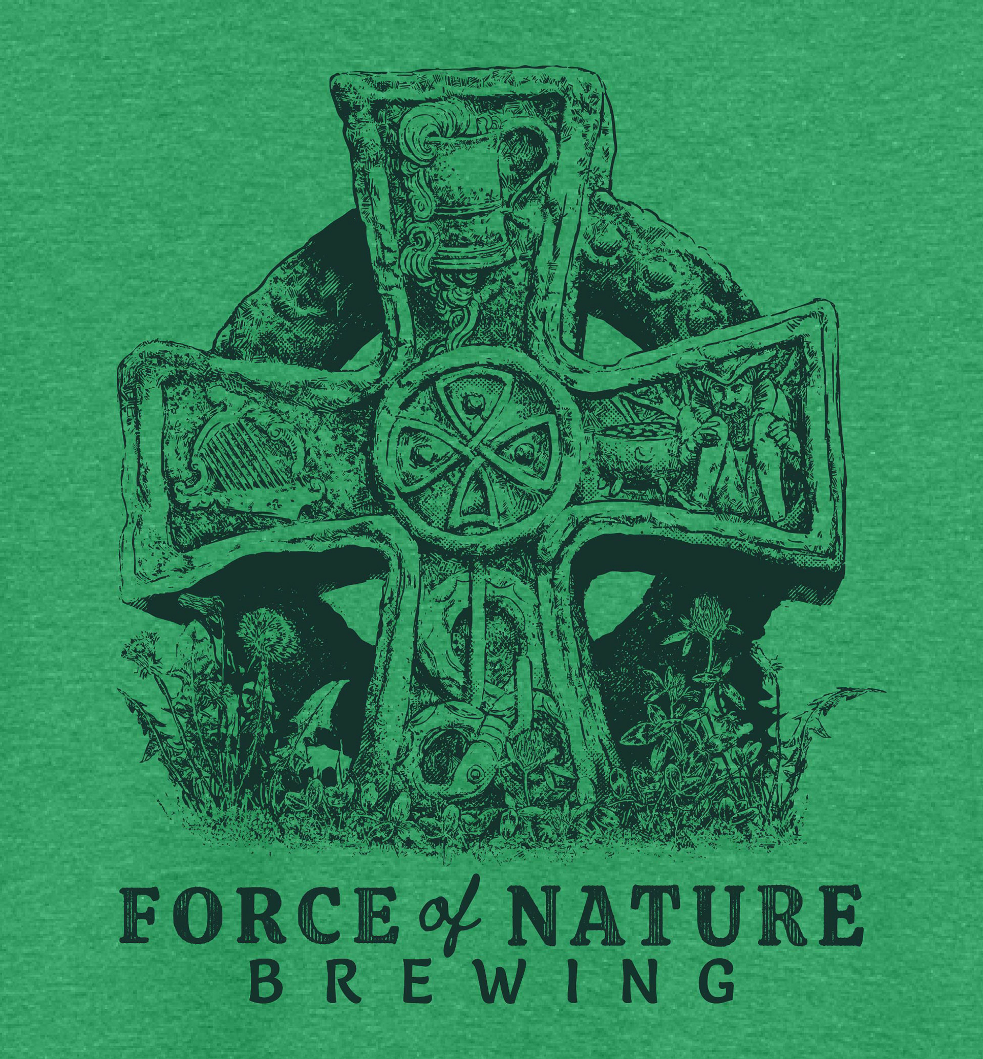
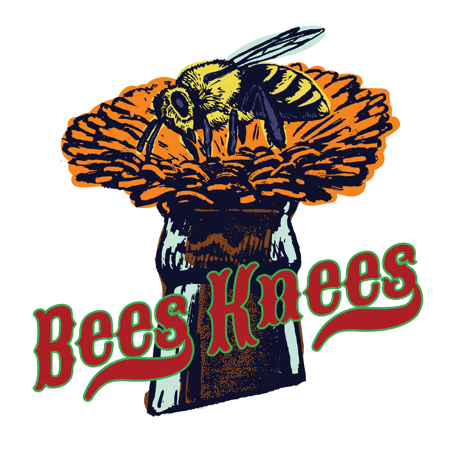
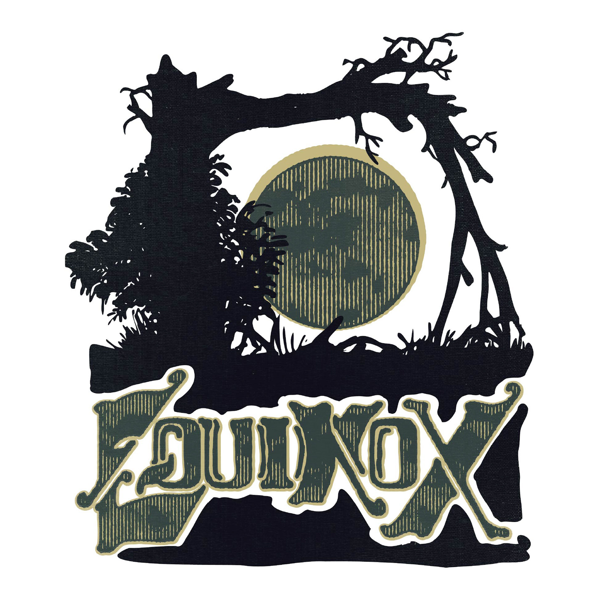
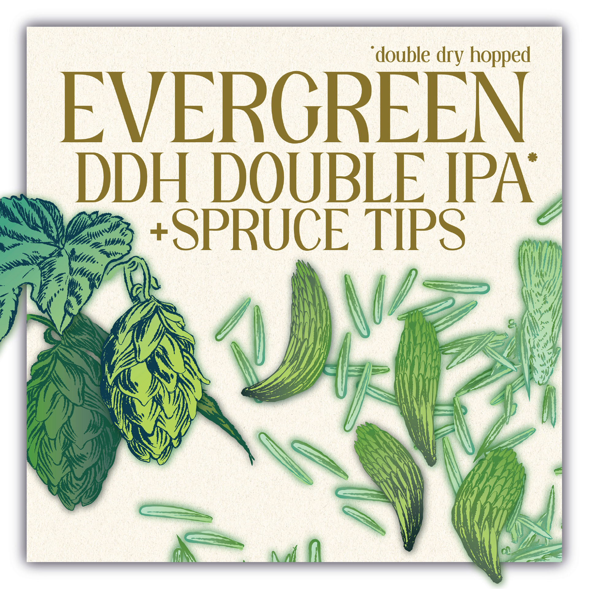
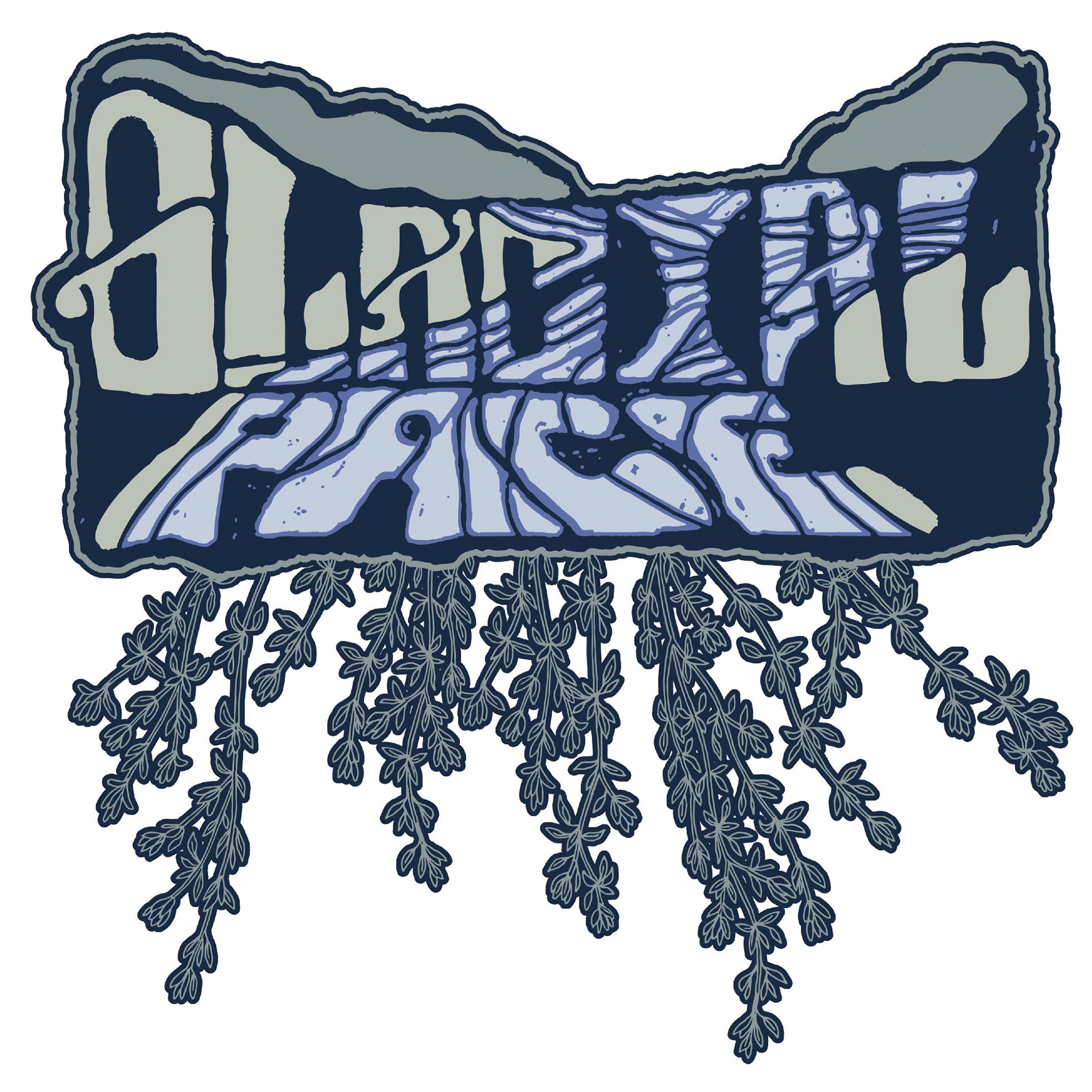
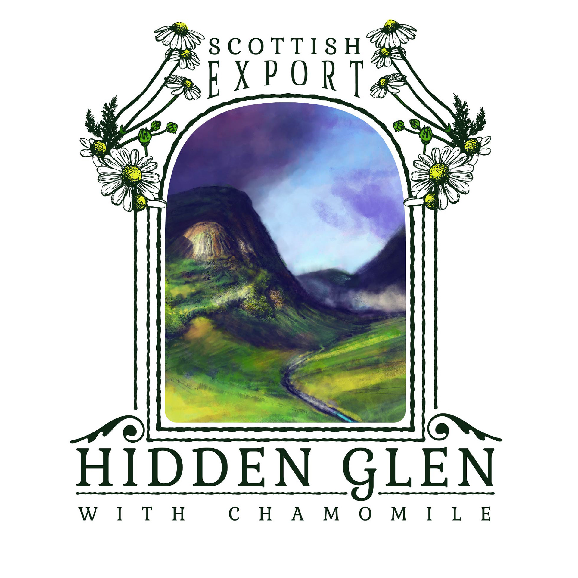
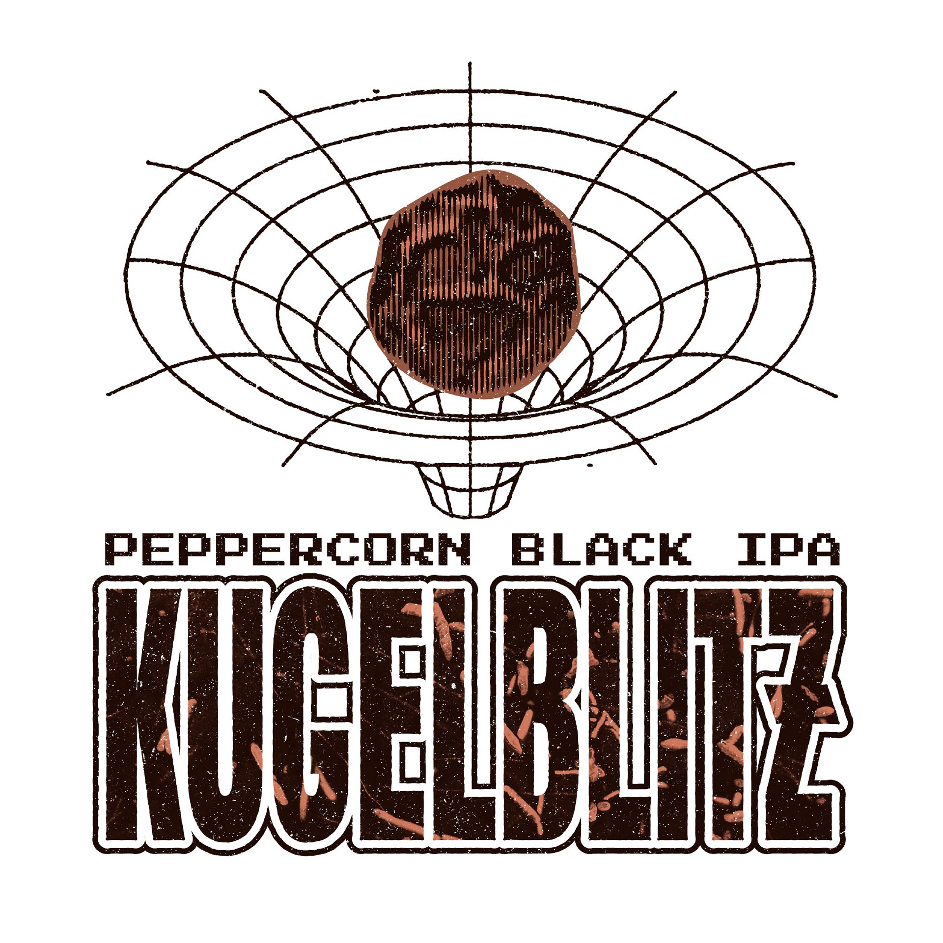
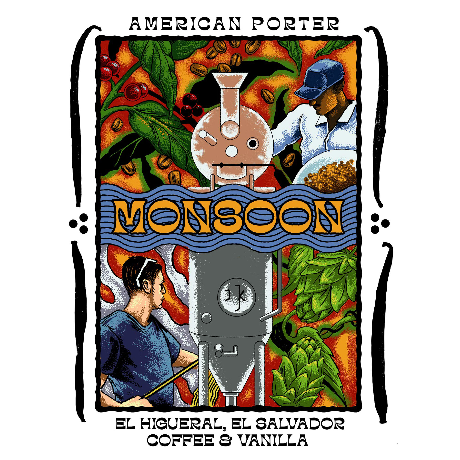
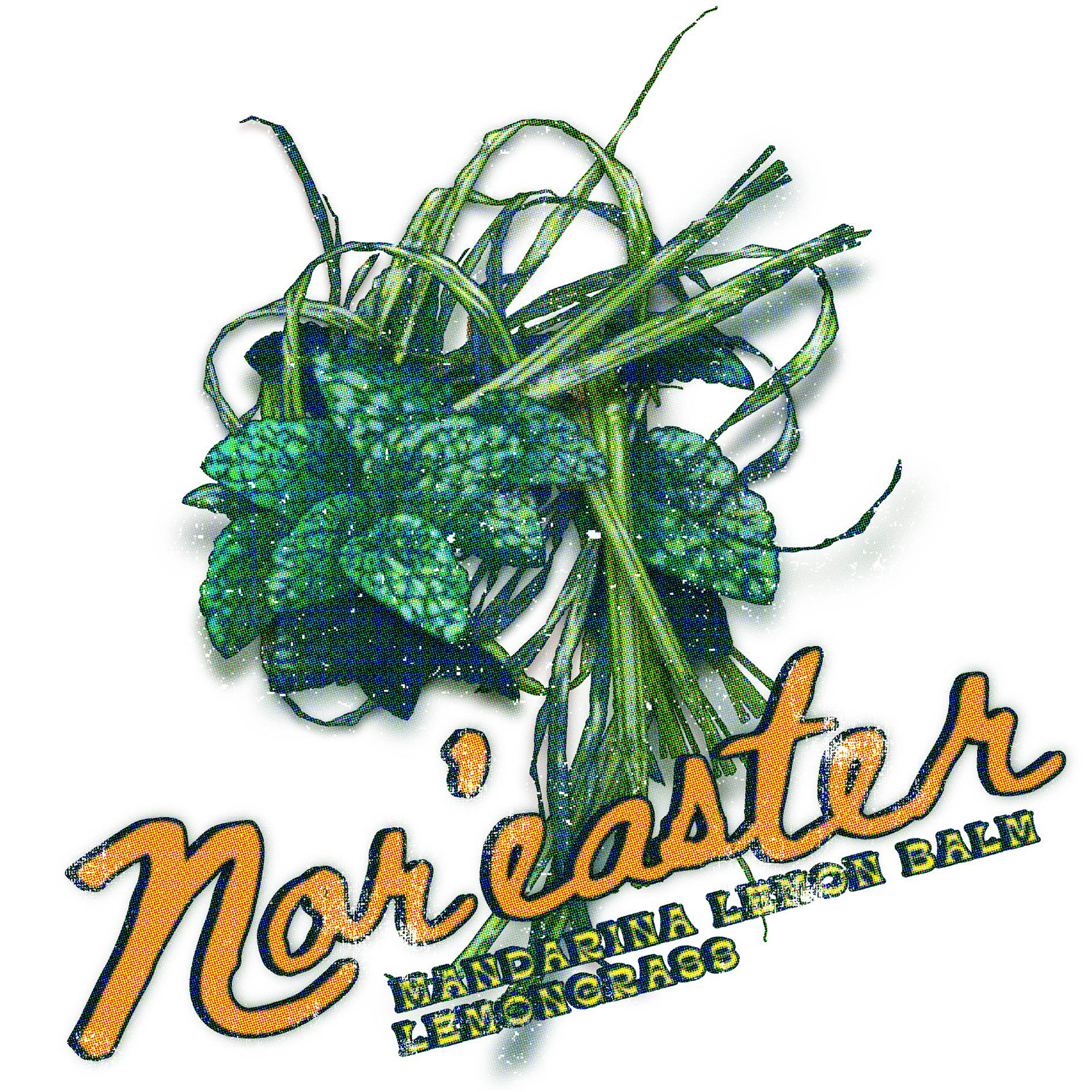
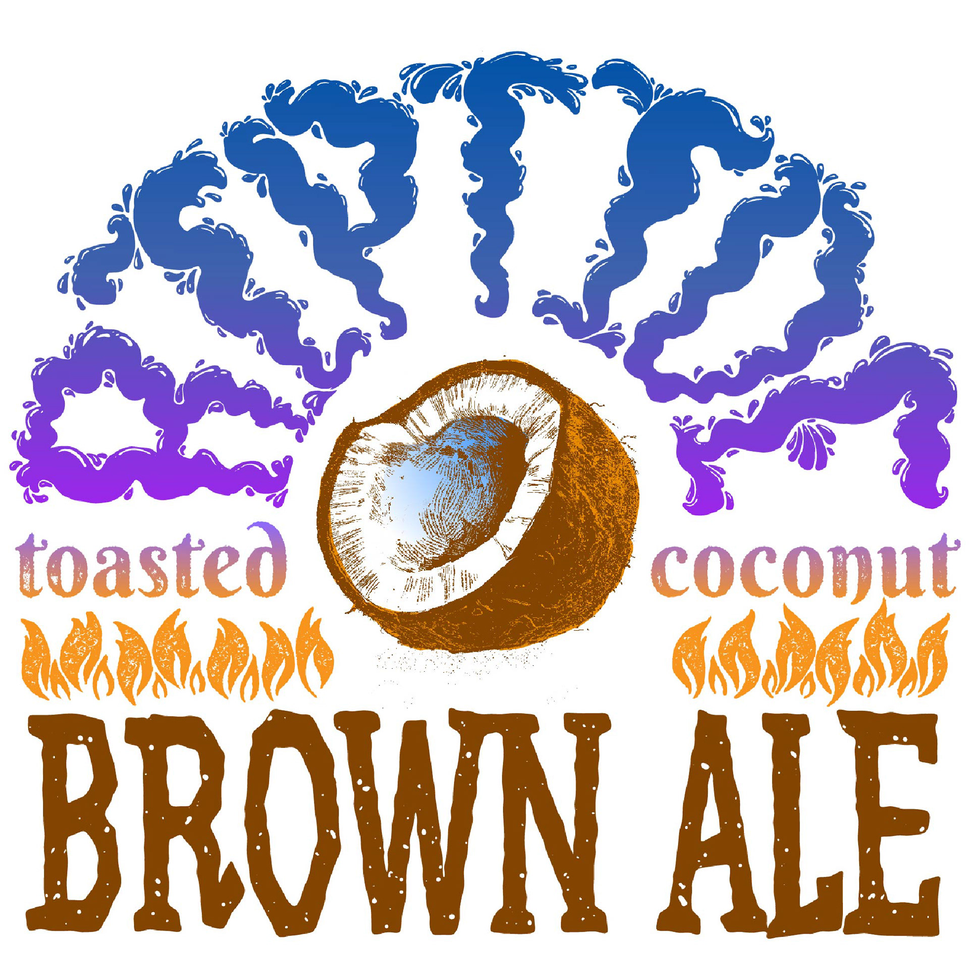
FORCE OF NATURE BREWERY BEER LABELS
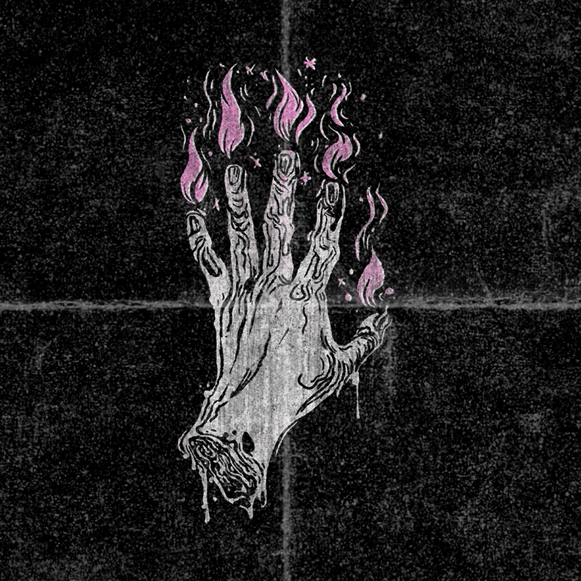
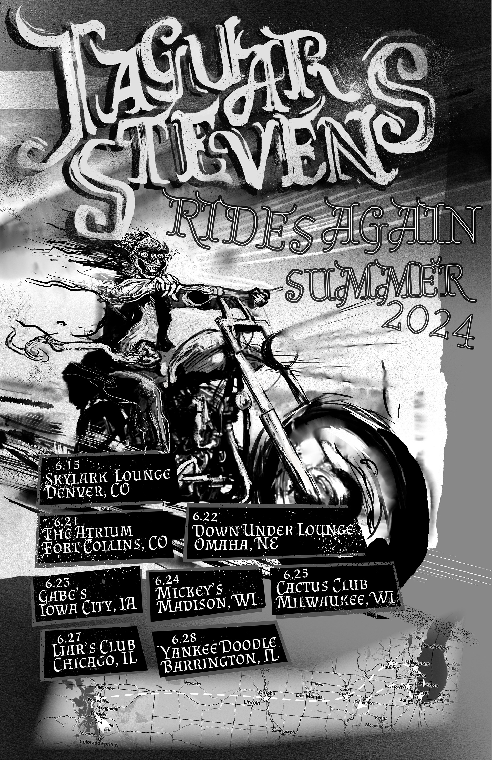
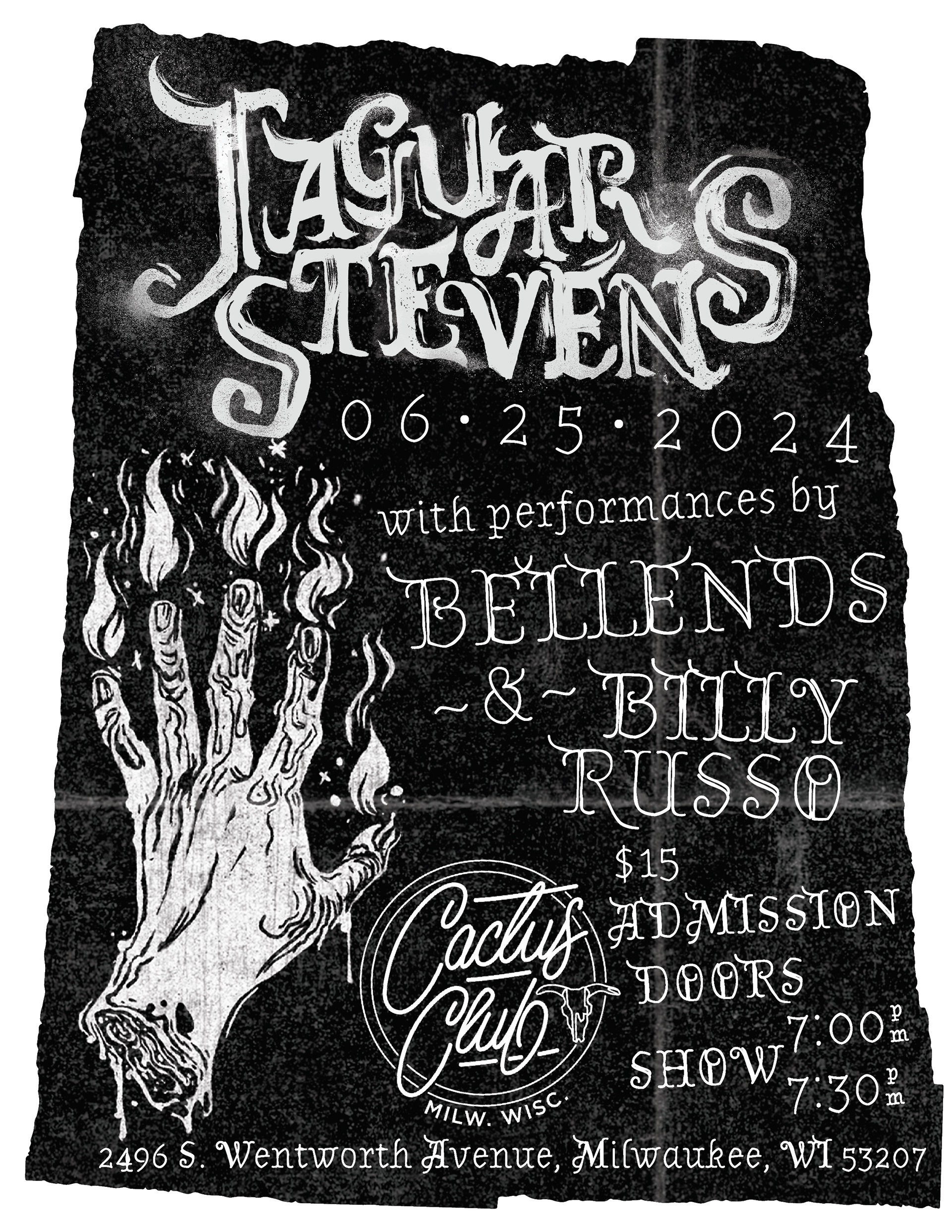
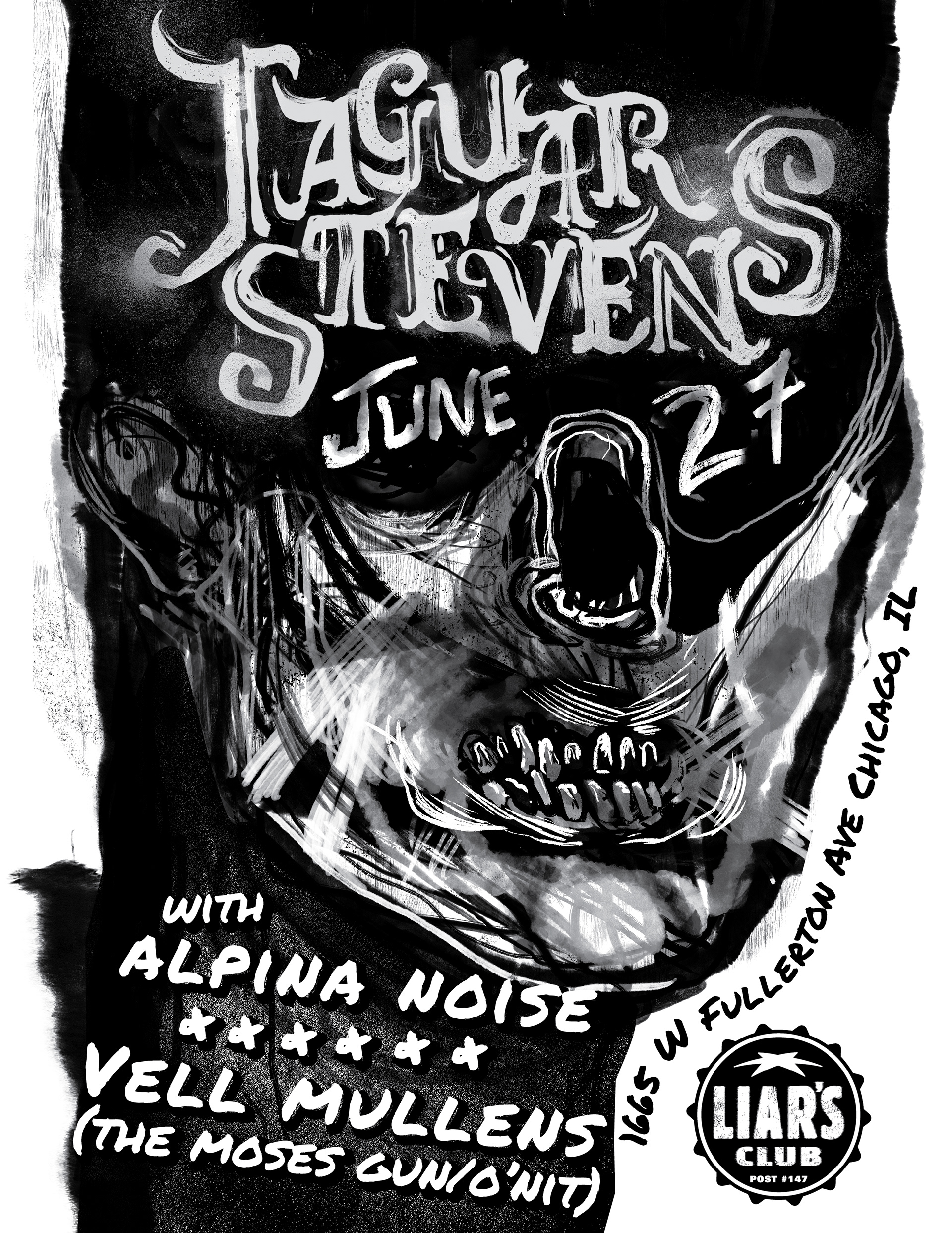
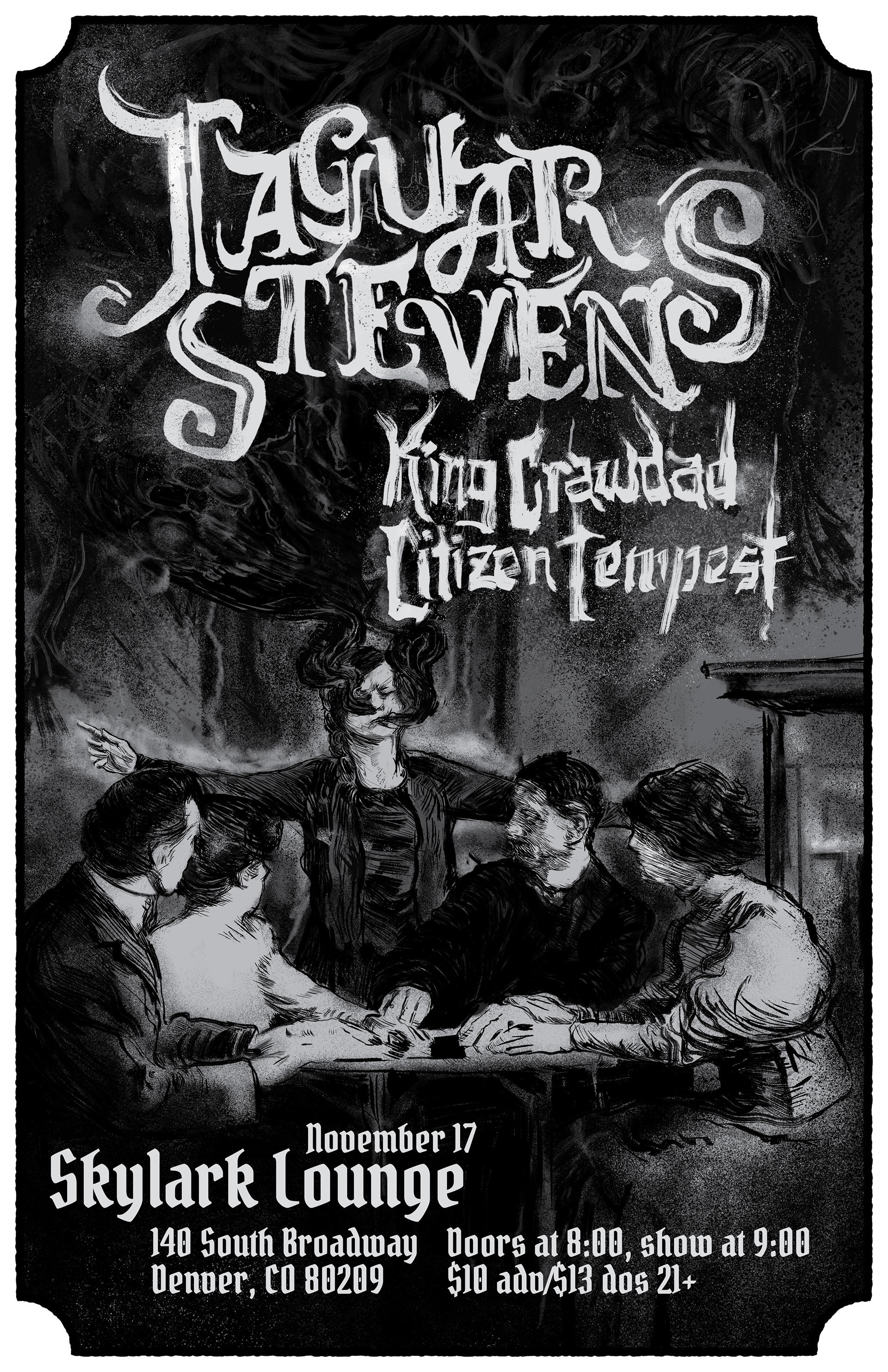
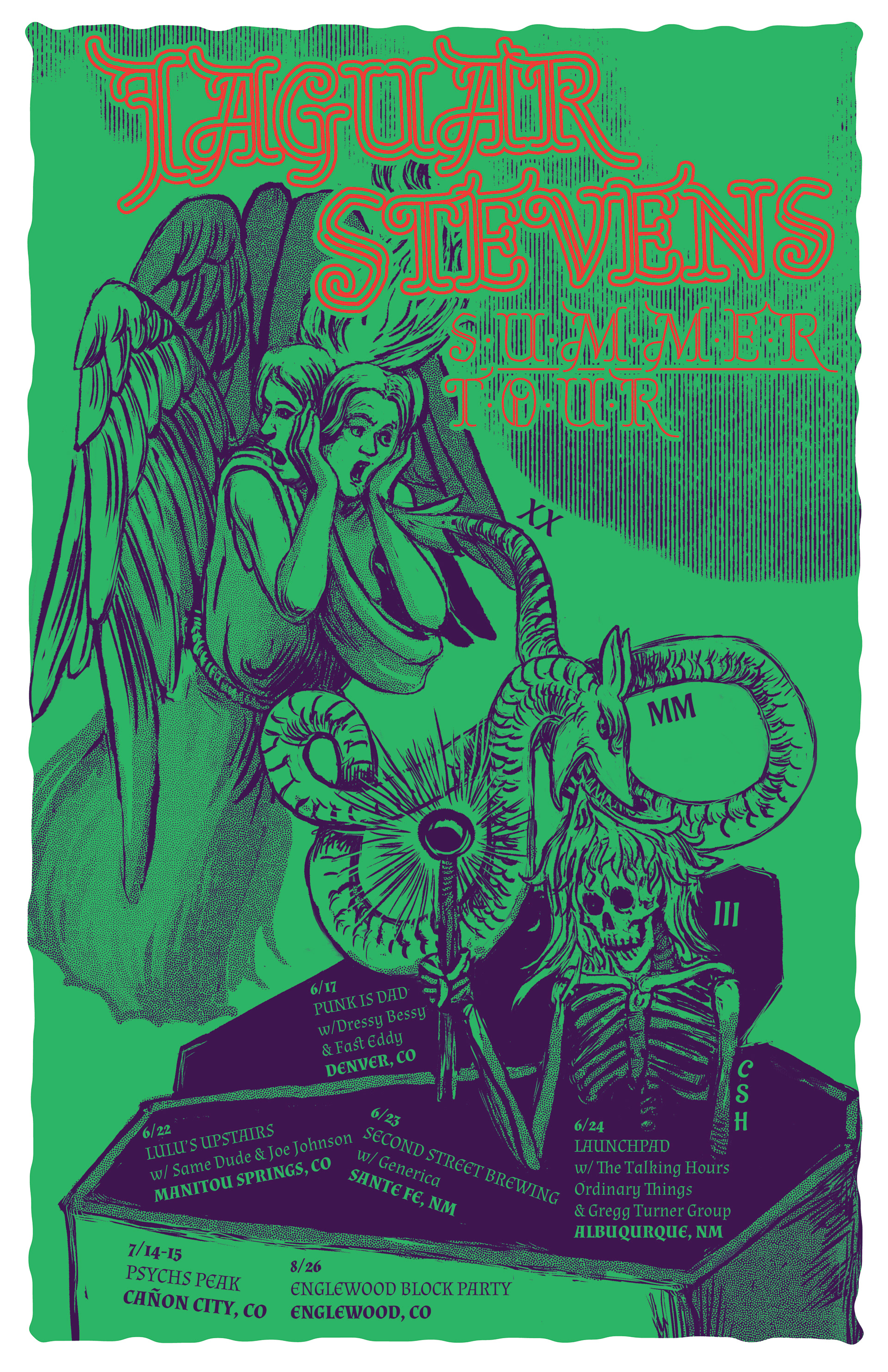
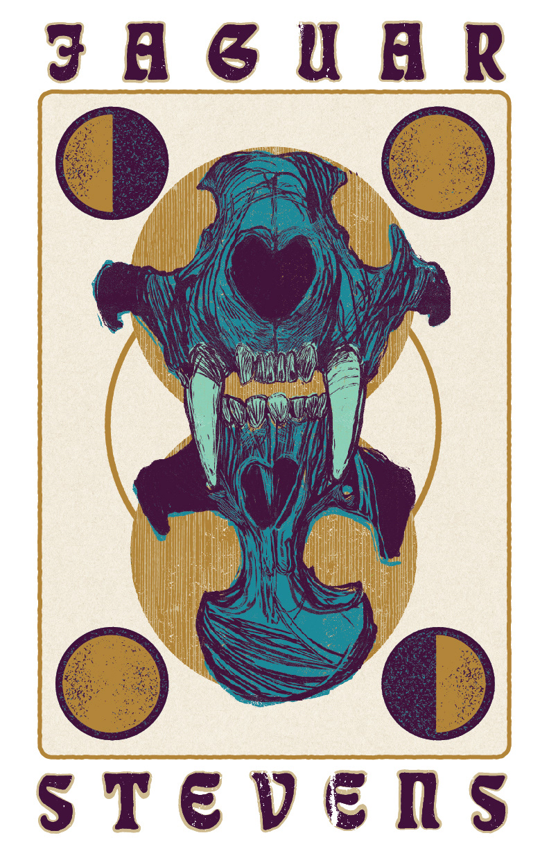
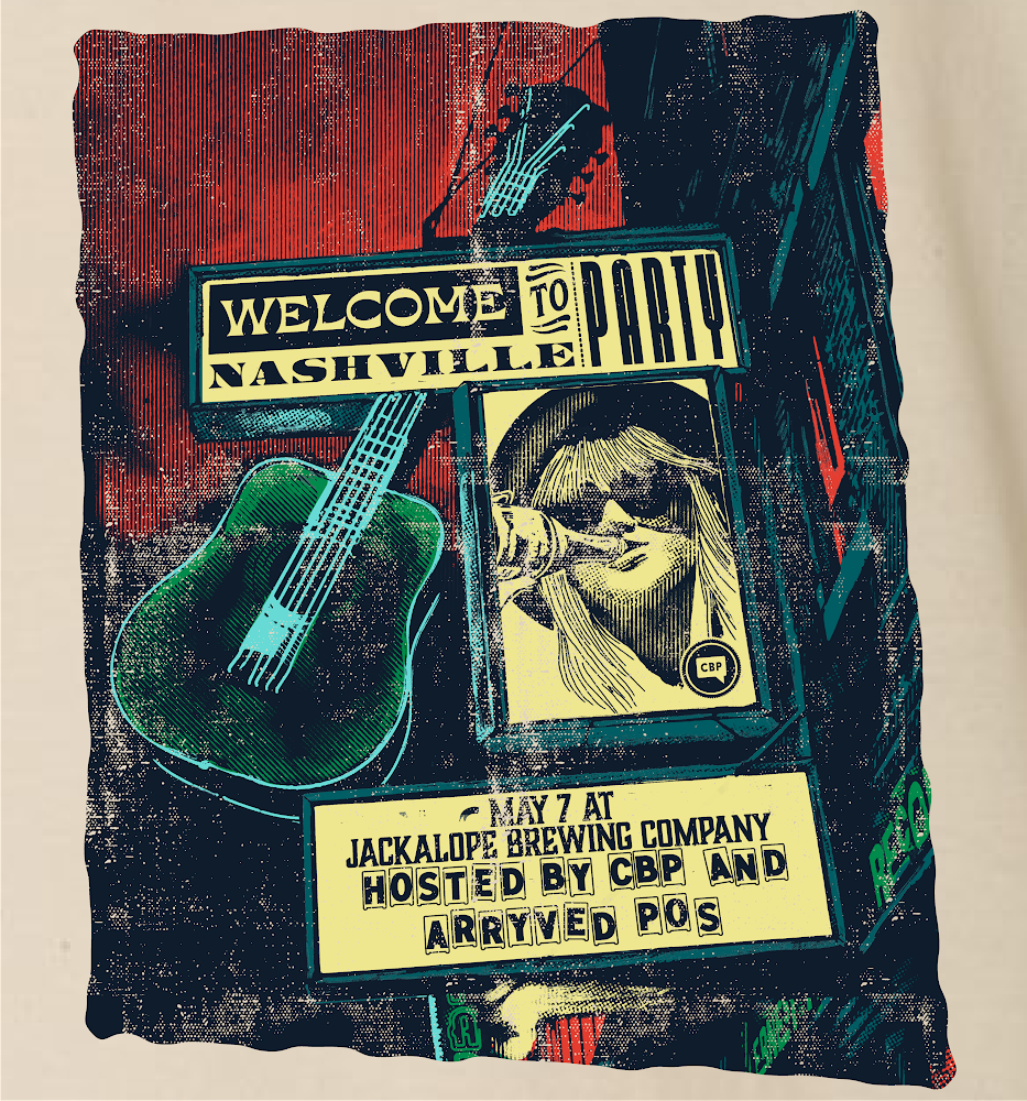
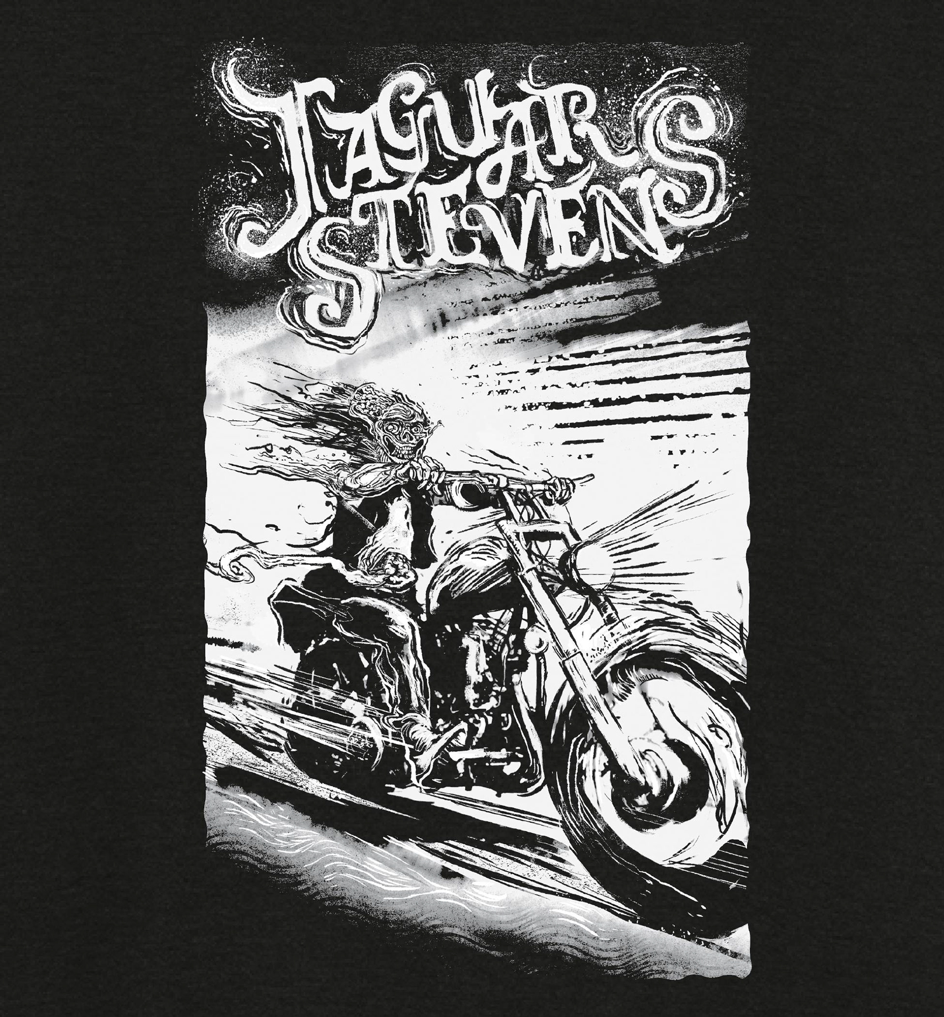
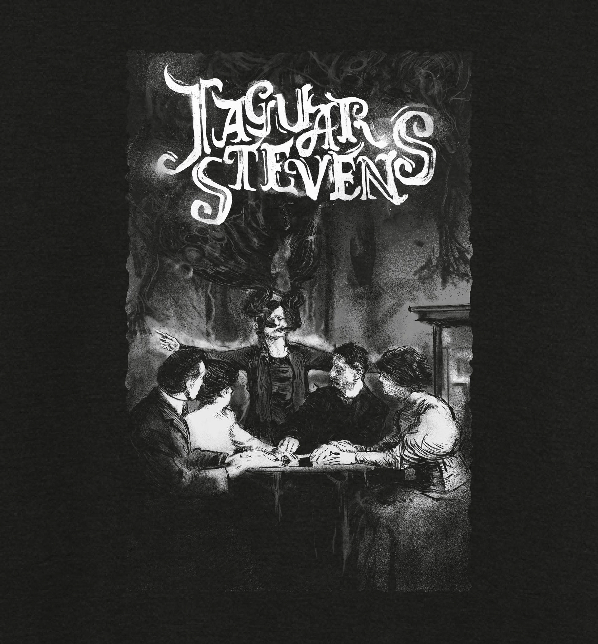
PROMOTIONAL MATERIAL AND ALBUM ART FOR MUSICAL GROUP JAGUAR STEVENS